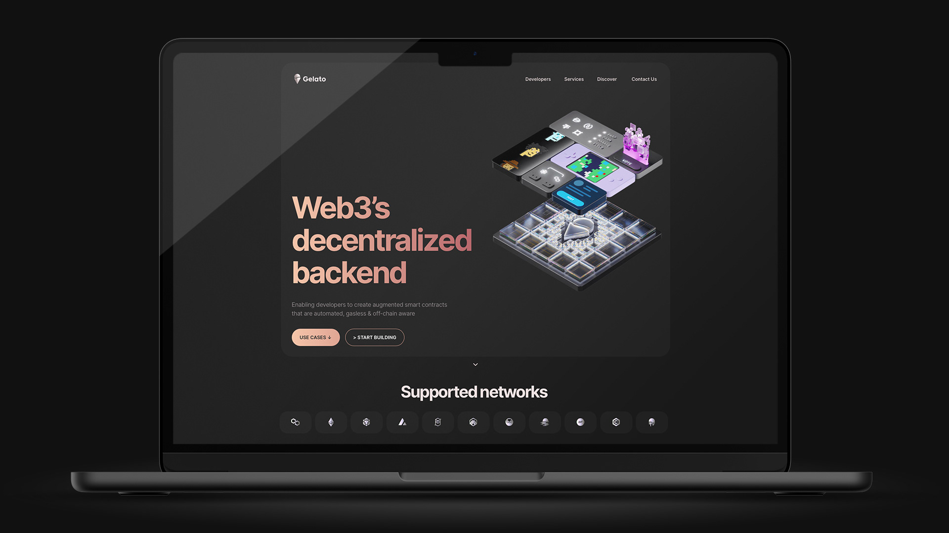
Web3 cloud and infrastructure platform
THE CHALLENGE
I inherited a brand with a name that fought its own ambitions: Gelato, Italian for ice cream, based in a Swiss Web3 company, trying to earn trust in a serious blockchain environment. What I found instead had no character at all. Alienating, neutral, and cold to anyone who came across it. Nothing in the visual language gave a person a reason to feel connected.
THE IDEA
A brand doesn't have to explain its own name. This one needed more than explaining, though. It needed a reason for someone to stop scrolling. Without that, nothing gets remembered. It just gets skipped and stays invisible.
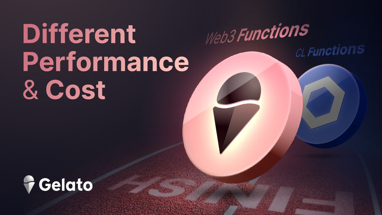
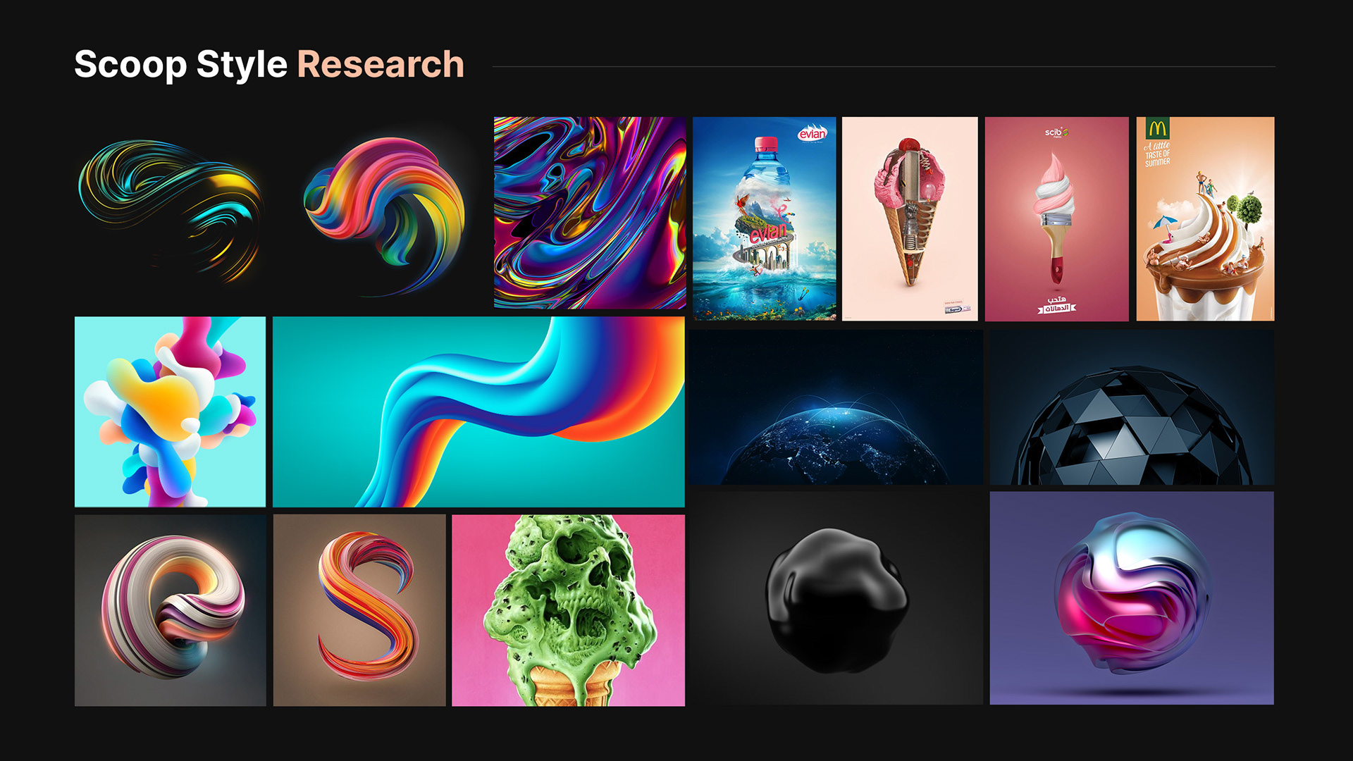
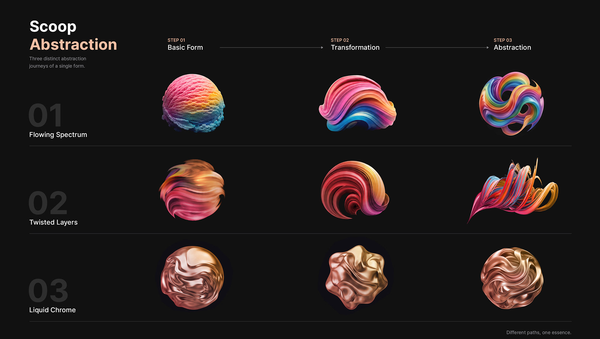
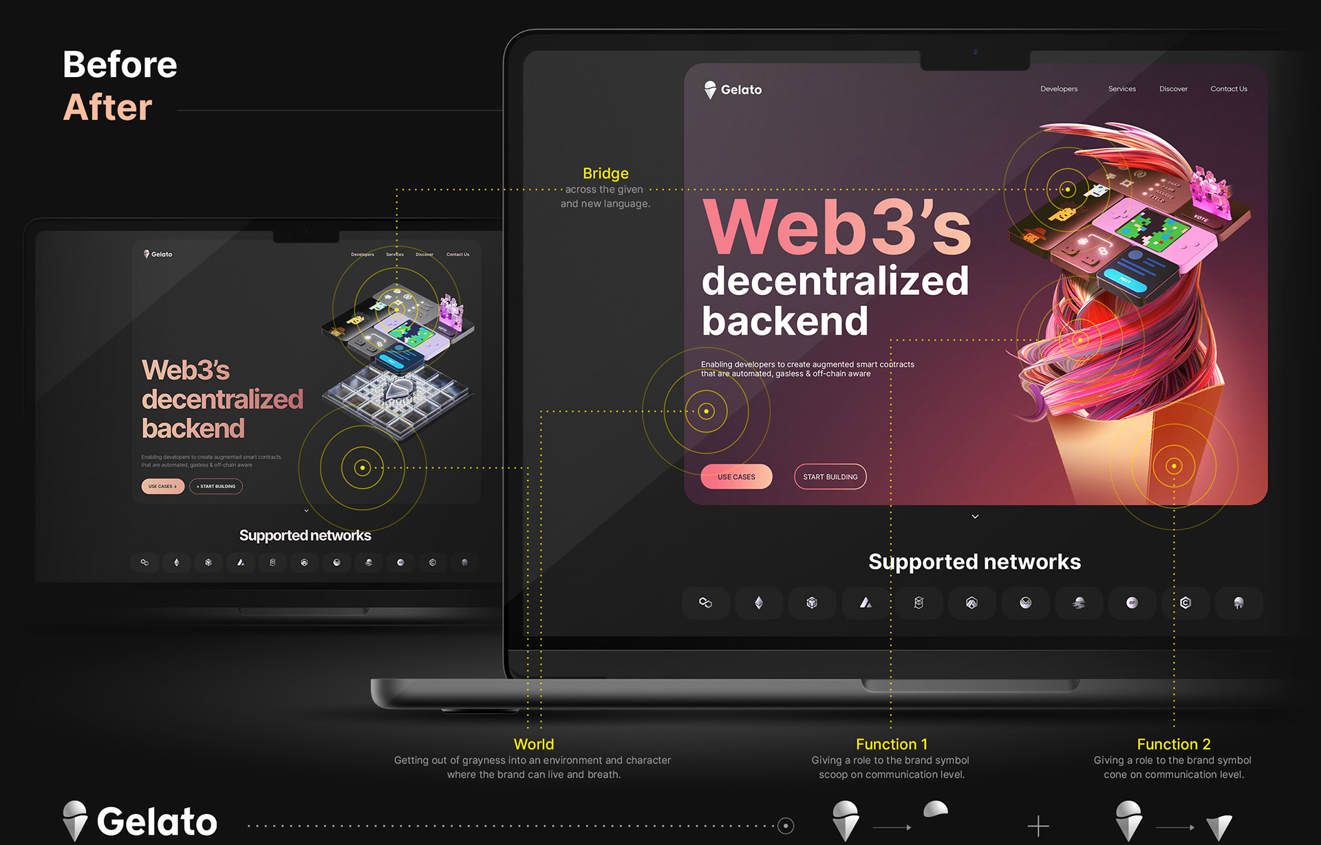
The logo already had the answer built into it. An ice cream, made of two parts: a cone and a scoop. The cone's shape matched the base of the Ethereum symbol, which made sense since Gelato was built on Ethereum. So the cone became fixed, always standing for the network. The scoop stayed open. It could be the product, the message, whatever Gelato needed to say that week.
The tone had to match. Not serious, not playful either. Friendly. That's the hook. A cold brand gets scrolled past. A friendly one gets a second look. This is the same instinct behind everything I make: bring what's complex close enough that someone actually feels it, instead of just seeing it and moving on.
THE CRAFT
Every design system looks resolved
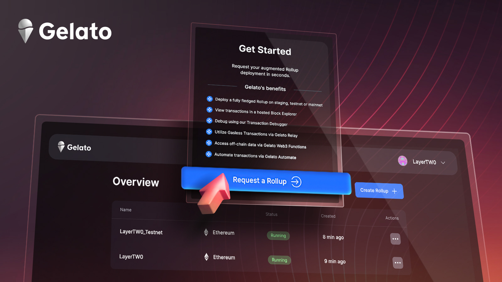
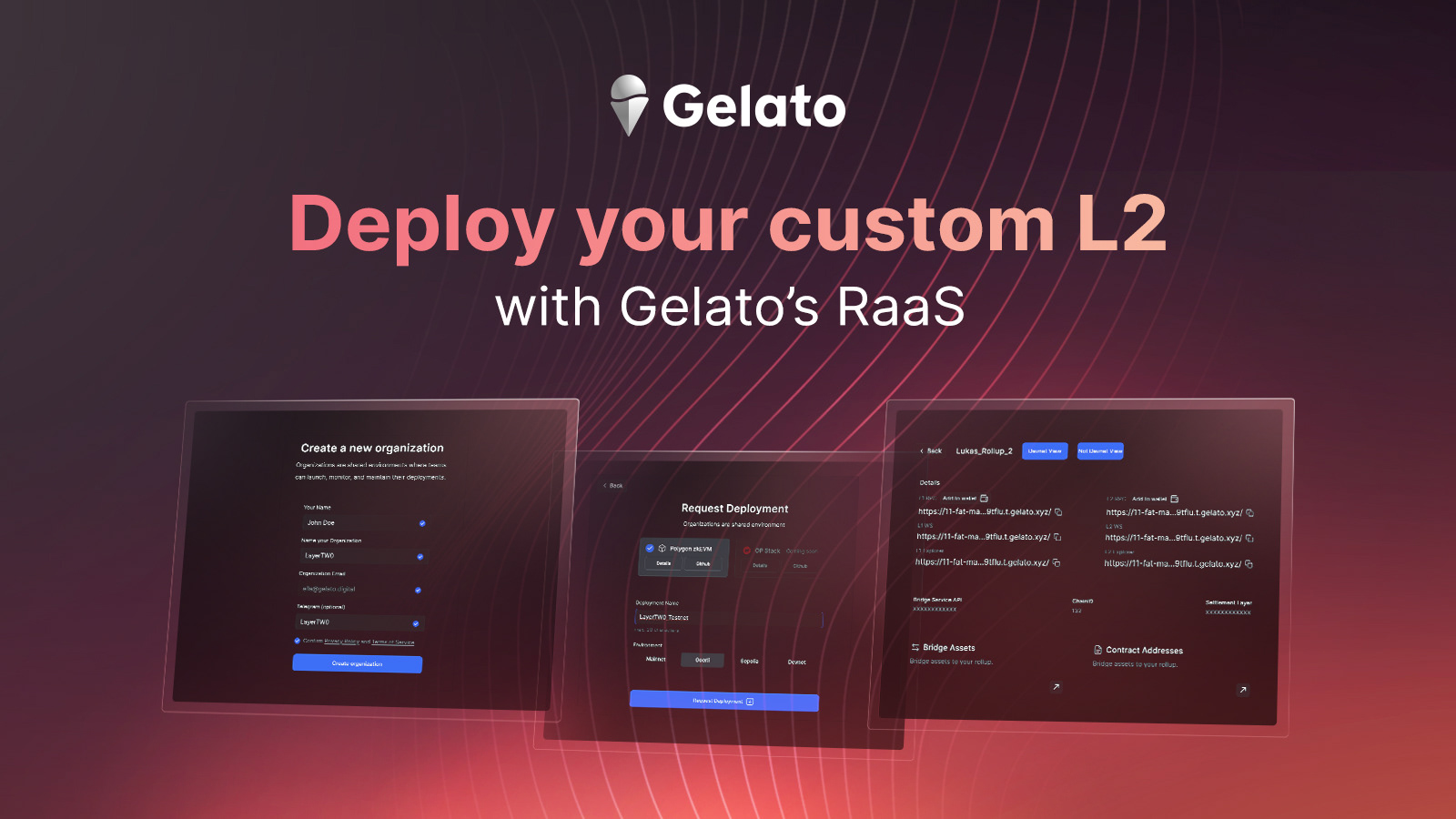
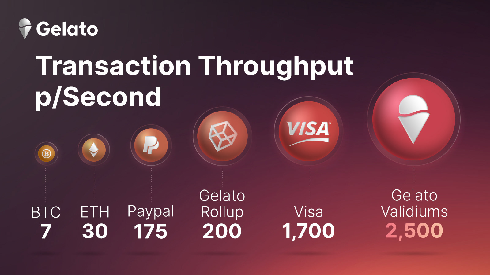
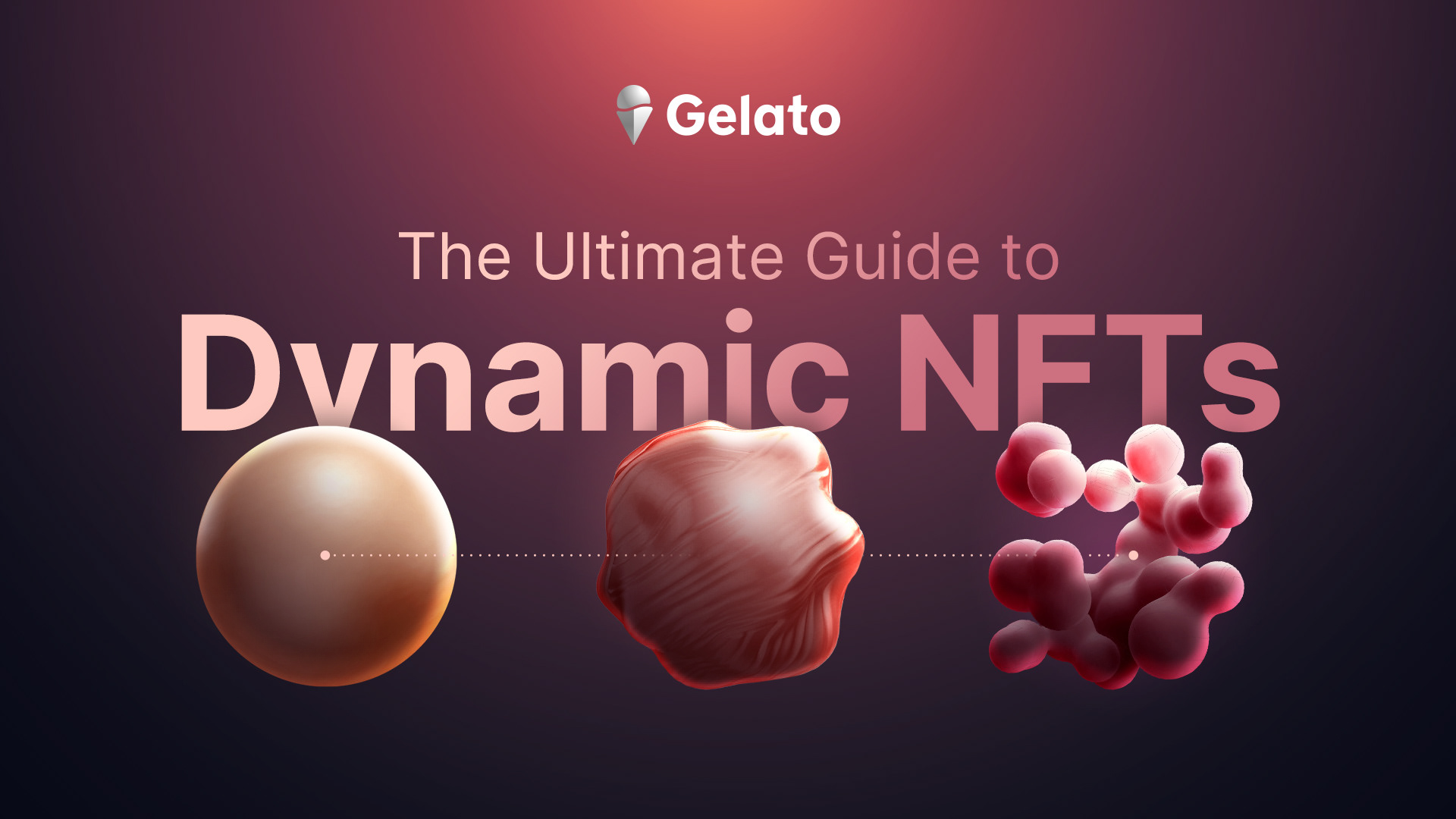
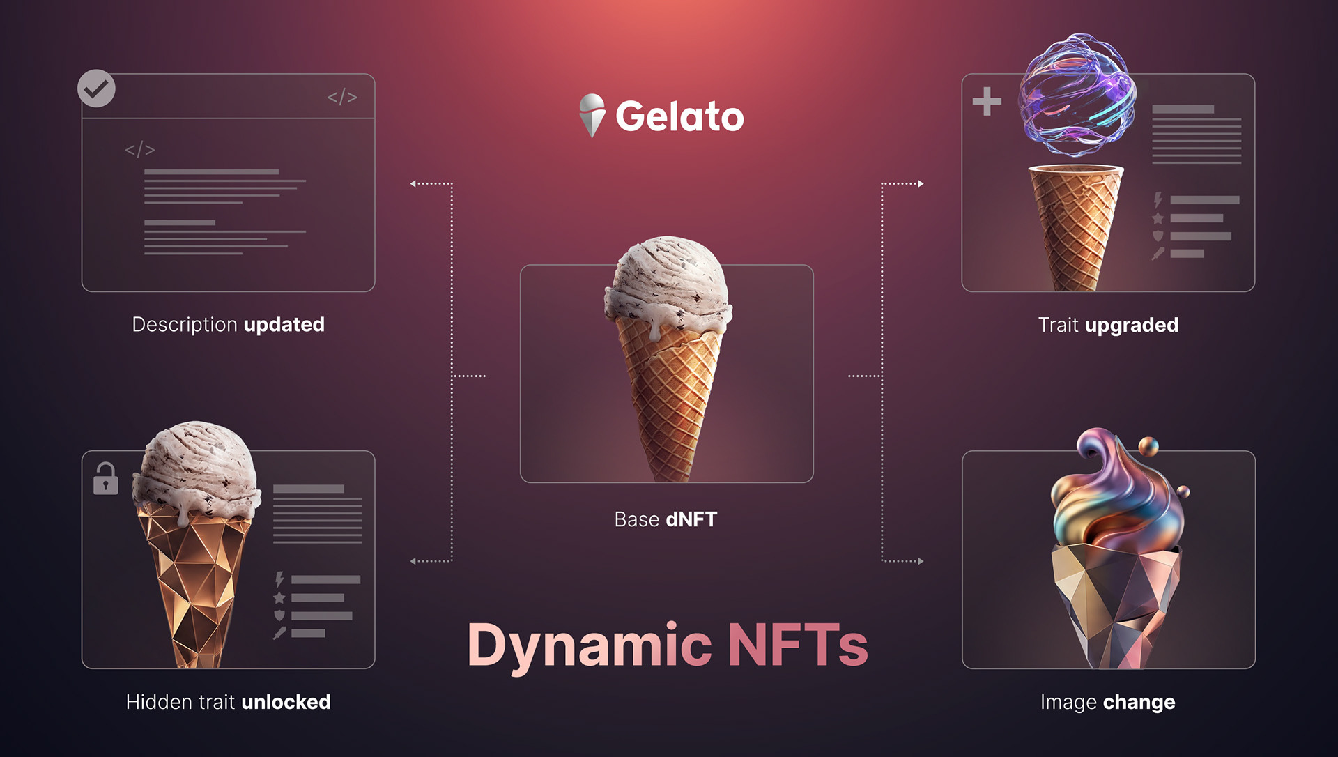
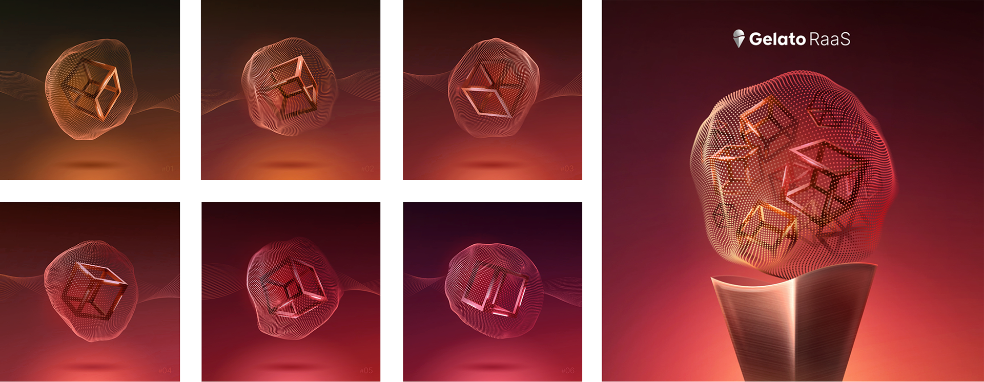
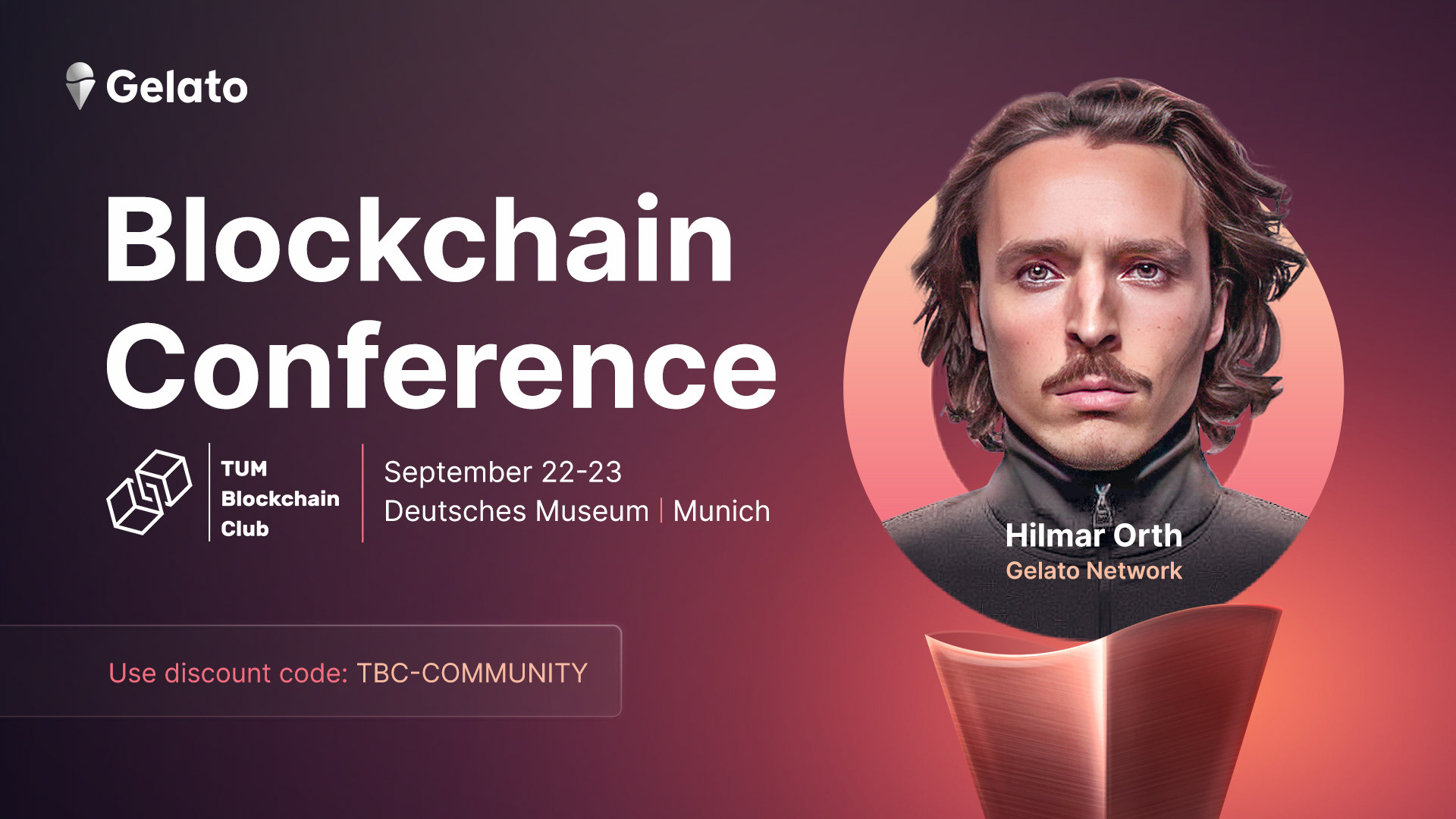
on a presentation board. The real test comes after, when the cone and scoop have to carry a product launch, a social post, a piece of news, whatever that week actually needs, and still hold their shape. This is the test. The system is in daily use, including the social, blog, and web assets I built for one of the first dynamic NFT platforms. Proof that the language could flex without losing what made it recognizable.


THE WORLD
Ice
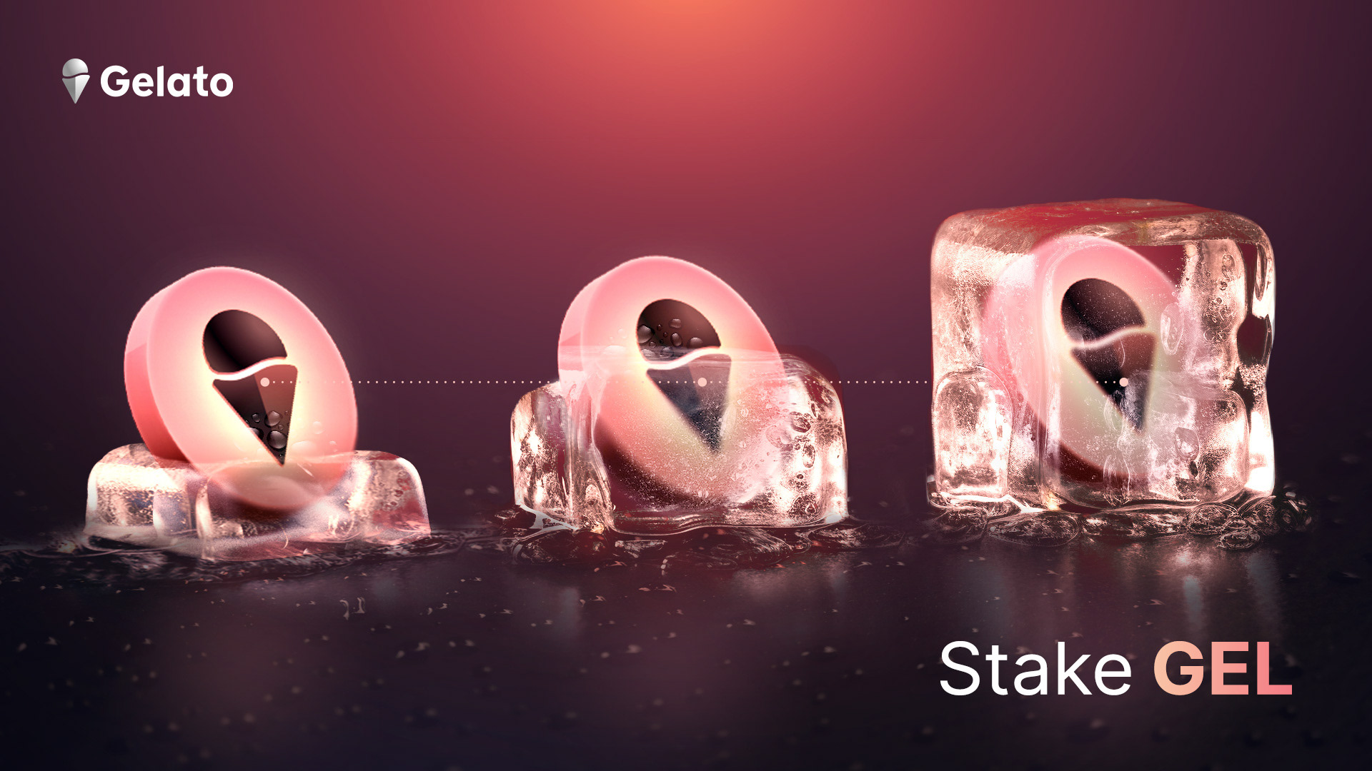
Ice isn't next to ice cream. It's already inside the name. Ice cream is frozen cream, held together by ice itself. That gave the next step its logic — not something added on, but something already there, just brought forward. Ice is transparent, clean, shiny, and smooth. A design can be all of those too: a clear structure, a clean style, a surface with the same kind of shine.
Beyond the Frame
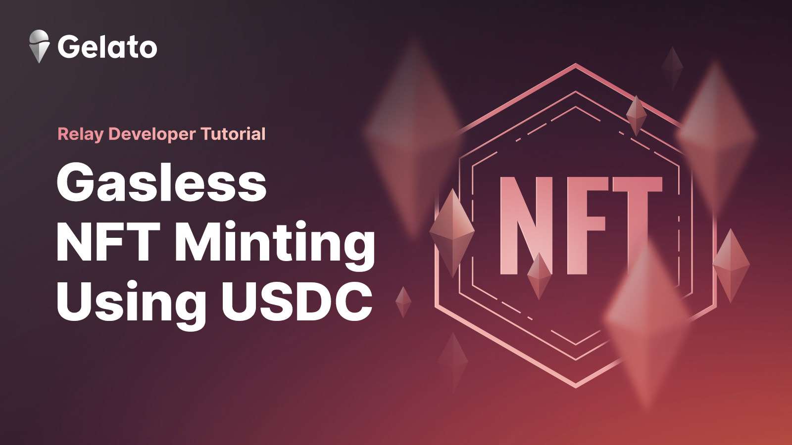
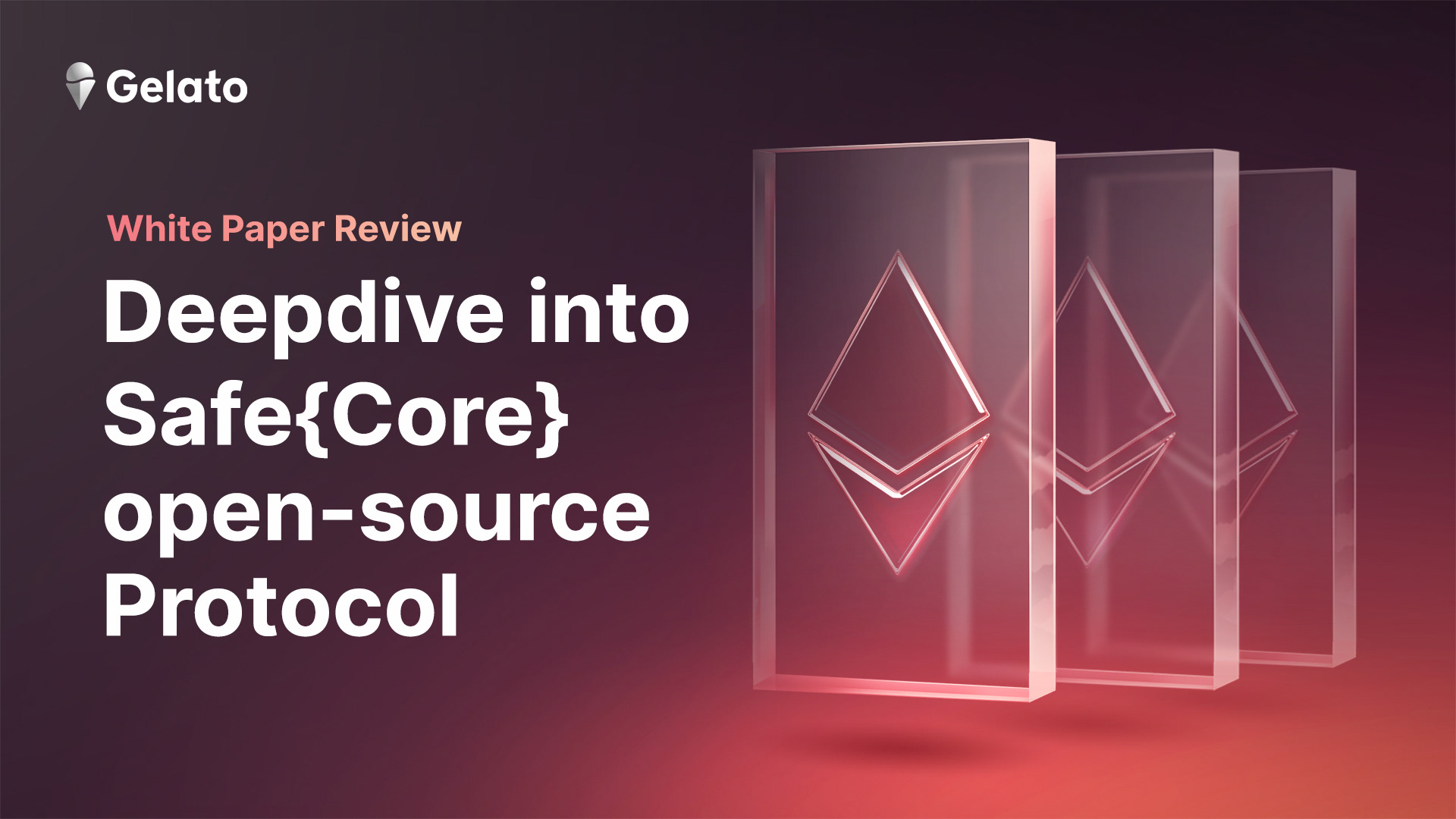
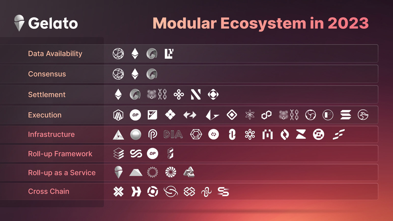
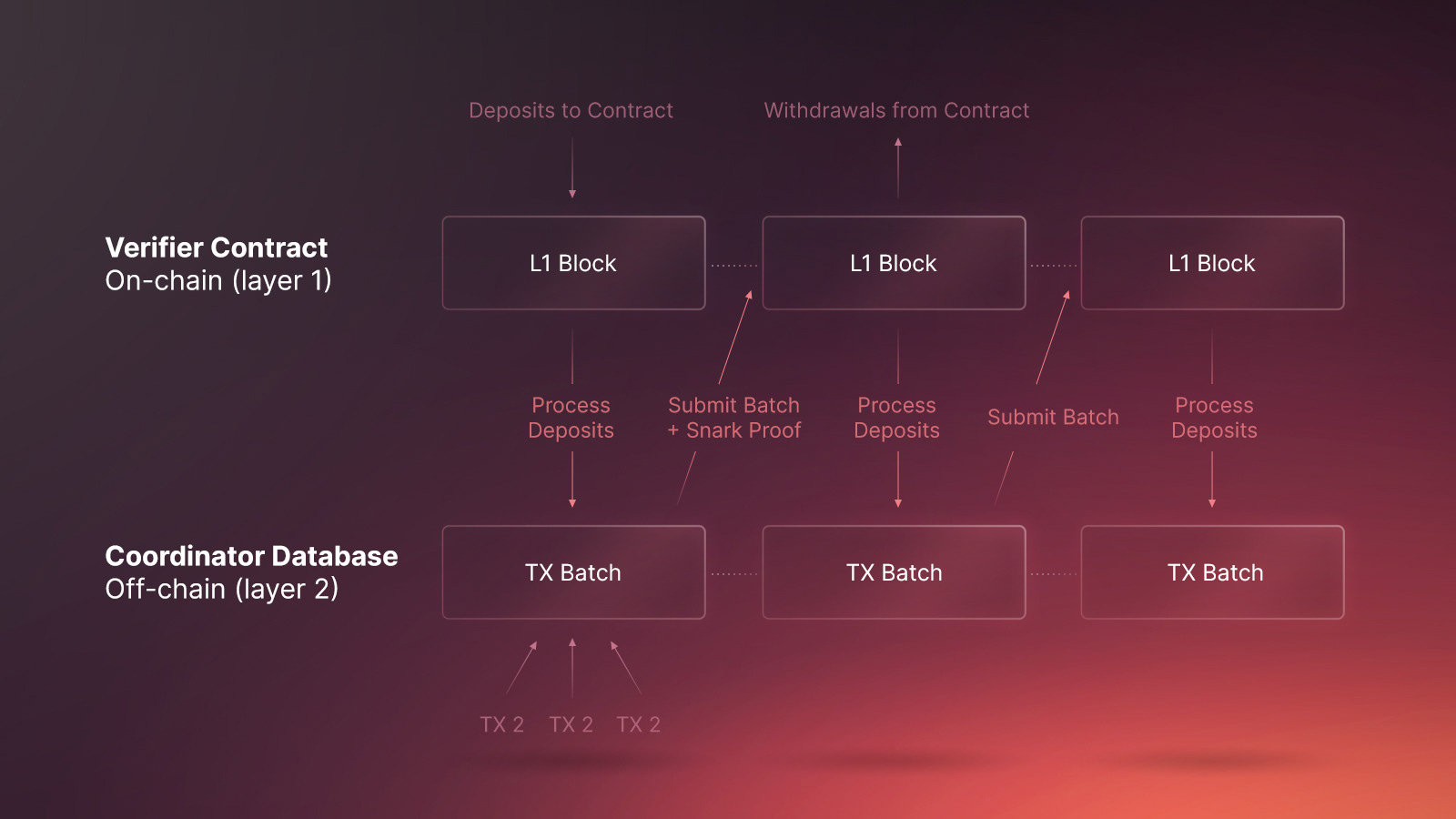
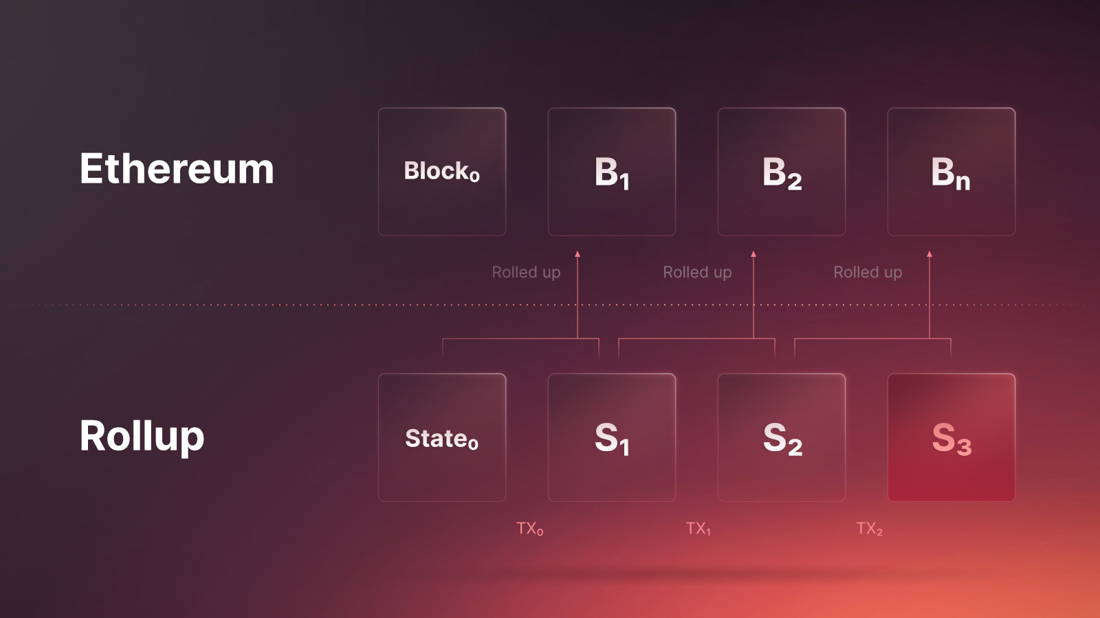
Not every brief fits inside a brand's main concept, and forcing it to doesn't serve the work. Web3 moves fast. Something new needs answering today, not once it's been reasoned into the cone-and-scoop framework. This is what that looked like. The brand's character held even without leaning on its main visual device. Prove the system was flexible enough to stay under real, immediate pressure, not just inside its own showcase.